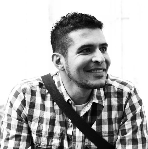
Let’s get to know you first. Tell us about yourself.
My name is Jorge Riera and I was born in Venezuela, I got my Bachelor’s degree in Graphic Design from Universidad de los Andes in Venezuela, surrounded with some great teachers such as Jorge Montero and Ramses Antolines. I have earned a Masters degree in Web Design and on User Interface while working abroad as a junior art director for in-time comunicacion in Madrid.
My big dream has always been to travel around the world and that’s what I have been doing since I have memory, I have worked in Spain, Thailand, Puerto Rico, New York and now in the Czech Republic. I am already planning to move this year to Russia or China, I haven’t decided yet.
I am an easy going guy but also a professional couchsurfer, because I think a designer only gets better by letting in everything that surrounds him, in my case it is cultures, it is other languages that other people speak, and that’s what encourages me to get a different approach in projects.
Currently I am the art director at Hullabaloo, an international advertising agency based in Prague, with clients like Coca Cola, Burn, Moya Semya, KFC, BMW and the Czech iconic brand Vitana. Apart from learning Czech I have also grown as a person and as a professional.
Cool, so what’s the story behind your website and its design?
I Am a manga fan, and I have always been fascinated with how only using Black and White they can create such a rich world full of life, from that part I decided to focus on the black and white approach, and for a portfolio I have always thought that:
- It needs to be simple, easy to navigate and easily understood
- It needs to reflect a little bit of your personality.
- The portfolio display needs to be clear
And based on that I decided to redesign my webpage. One day when I was working on my own logo I realized that my name Jorge, when inverted, it looks like a character (some people see it like a cat, some like a dog, so it appeals to cat people and dog people alike, targeting a broad audience ;)). After that the process was easy, having a character and styling it was just how to bring the character to life and part of the web.
What part of your website is your favourite, and why?
My favorite part is the home page and the effect the eyes of the character are following the mouse movement, many people don’t notice this but I think it is one of the most important details of the whole webpage.
I always work in a dupla with a developer who is also my best friend from highschool so that means that we have been working together for around 15 years now, Gian Franco Olivieri (alias Gianko) for me he is one of the best developers out there, and he was like WOOO that will take me ages, it will never look good etc, so, I was getting used to the idea that it will never happend and one night I got and email that said check the link, when I click, I saw the eyes moving and I knew that the whole design was going to work.
Is there anything you wish you knew when you first started building your website?
Maybe a little bit more into the animation parts, and how to design for parallax. It took me a few rounds to be able to figure it out, thanks to Gianko for helping me again with that. I am a pencil guy (old fashion, I still believe it is the faster way to visualize things) so when I finally understood and drew everything then it was easy.
Any upcoming changes we should look out for?
Yes I am working now on a way to highlight the new work on the portfolio, in a way that still looks like it belongs to the whole design and to make it clear that it is important.


