Let’s get to know you first. Tell us about yourself.
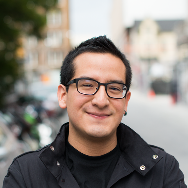
My name is Ricardo Vazquez and I am a UI/UX and iOS Designer based in Toronto, Canada. I love art. I love code. I love coding art.
Growing up around a family of musicians and artists, I decided to pursue meaning in art. After taking a slight detour when realizing I was not cut out to be the next Jackson Pollock, I endeavoured into the digital realm. What brings me the most passion, above all, is being part of a collective of individuals who are painting that Madonna, who are building that Eiffel Tower, who are part of the next life-changing movement.
When I’m not designing, I spend my free time rowing along the rivers in Ontario, Canada. Rowing helps me design better; it’s one sport I will never leave. Along with rowing, writing helps me keep my mind in check. I write regularly on Svbtle.
I am interested in culture, design, aesthetic, wit, reality, existence, history, education, thought and, above all, the relentless pursuit of happiness.
Cool, so what’s the story behind your website and its design?
This website focuses on a highly minimalistic approach to text and images. Whereas websites that immerse the user in the visual experience are generally considered to be effective, I chose to take a subtle approach to delivering the message and informing the user. By focusing on the serifed typeface, I was able to creative impacting statements that did not require any graphic element to enhance its presence. Implementing texture across the website enhanced depth, and increased the presence of semi-transparent elements on the website. I took the creative decision to create a dark website in order to increase legibility for blind-coloured users, as well as to highlight the parts of the website that did feature colour within them, such as social and project-specific icons. I often have a hard time reading black text on a white background, so this decision also stemmed from personal preference. The ultimate goal of this website design is to implement content hierarchy in a world of visually driven experiences.
What part of your website is your favourite, and why?
Oh boy, I have quite a few!
Using the border-radius property gave some elements on my website a unique shape, which helped drive the user’s attention to it. On the About page, for example, the biographical picture is immediately spotted by the eye, as it features a shape that is neither a rectangle nor a circle. I believe that custom CSS shapes will drive web design forward in the near future. Even a simple shape with custom border-radius properties has the potential of creating a deep impact within the user’s visual memory.
I used the transition property to decrease opacity in order to respond to the user’s hovering actions. Even though the transition property is fairly well used presently, having a textured background for which the element to fade out on creates a profound sense of depth. Fading out an element loses no visual hierarchy. Even having a semi-transparent navigation bar intensifies the physical feel of the website with the aid of texture.
Lastly, media queries are the most important CSS portion of the website. Media queries are what allows the website to be responsive. I have media queries that accommodate the aspect ratio of an iPhone (portrait), iPad (portrait or landscape), 12” Netbook, 13”Laptop, and 15”+ screens.
I would say my absolute favourite part of working with the CSS on this website was making mistakes. I often find that the mistakes I make turn out to be exactly what I wanted, or even better. The biographical picture on the About portion of the website was created out of an error in my CSS coding (shh… don’t tell anyone!). That is the beauty of CSS; it is so malleable and magical at times.
Is there anything you wish you knew when you first started building your website?
I redesigned and coded my website two times before settling on this current iteration. Looking back, I wonder if there were little bits and pieces I could have saved. Because I was designing with my own assumptions in mind, I made a mistake of not validating them. User testing is an imperative part of the UX process. I did not pursue User Testing on my website, as I thought it was just going to be for me. However, Design encompasses touching people’s lives every single day. We, as designers, need feedback from our users. From now on, I will do user testing on usertesting.com and usabilityhub.com for my personal projects.
Technologies, languages, frameworks, or libraries?
Though this website does not employ the use of a CMS, I have used the very helpful layout Skeleton.css, the usable effects of jQuery, and the amazing community of developers who make HTML, CSS, and JavaScript better each and every day.
Any upcoming changes we should look out for?
This website currently has no underlying CMS structure, and it should. During the coming weeks, I will transition this website to Ember or Middleman. With the organic HTML and CSS, I have already created the theme for the website, the next challenge will be to decide what fields are dynamically driven. I am really excited for this step, as it will make updating my website with new projects a breeze.