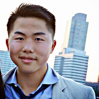
Let’s get to know you first. Tell us about yourself.
I’m the fulcrum of many one-to-many relationships such as my role at Squarespace, Startup Job Fair, and my role in Alpha Kappa Psi. I hope to partake in many more side projects. I understand value of relationships and how to create value from these interactions. After all, employees are any company’s most precious resource.
I’m on the marketing team on Squarespace—focusing on subscriber growth through high-volume, high integration media buying and planning. In a nutshell, I tell people who know (a lot) more people and have a huge fan base about Squarespace.
As an organizer in the NYC Startup Job Fair, I’m part of a team that brings hundreds of startup companies and thousands of job seekers in a space that provides companies with a rich talent pool and job seekers with access to a wide spectrum of exciting, new companies.
I’m part of an international business organization called Alpha Kappa Psi, As president of the chapter at Baruch College in New York City, I set high expectations for professional events that my team organizes. Some of our latest panelists are Fredrik Eklund (Million Dollar Listing) and John Gomes from Douglas Elliman, and Solomon Choi, the CEO of 16 Handles.
Cool, so what’s the story behind your website and its design?
I help organize some job fairs. I organize entrepreneur workshops on some weekends. I need an online medium to express my role in all of those projects and share my work with those who are interested in working with me. It fits within my narrative of a non-technical web user to use Squarespace since Squarespace allows me to host, design, and manage content all in one place. If I do feel like adding custom HTML or CSS, I can dive right in. For my website design, I currently use Marquee, a Squarespace template made in-house by our award-winning design team.
What part of your website is your favourite, and why?
I love the parallax effect that helps focus content and text within the same context and allows one to immerse in the story that the website tries to communicate with you. I’m a huge fan of great typography. Some of my favorite fonts are Museo, Archer, Avenir, and Proxima Nova. The font on my website is Museo Sans—the letters are spaced apart and bent slightly to give off a relaxed look.
Is there anything you wish you knew when you first started building your website?
I just finished learning SQL and in the middle of learning Python, HTML, and CSS. I’d like to my website to be more immersive and actually showcase some of my newer projects better. After learning what it takes to build a website from scratch, I’m glad I saved so many hours—yet it’s still vital to understand all the fundamentals of web development.
Any upcoming changes we should look out for?
I might switch over to the Supply template created by my friend George Zhang It’s a great product-oriented template. Feel free to try out Squarespace.


