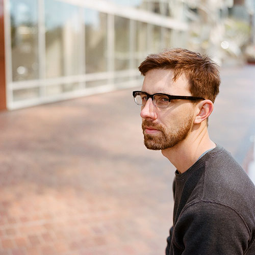
Let’s get to know you first. Tell us about yourself.
I’m Chris. I’m a product designer living in San Francisco, currently on the Instagram design team.
Cool, so what’s the story behind your website and its design?
The site is extremely simple and basic, but I wanted it to give a sense of who I am, the basics that people might want to know about me, and a taste of what I find to be beautiful in life. The photos, color palette, and structure of the design certainly say a lot about me.
What part of your website is your favourite, and why?
I’m fairy happy with the full-bleed introductory photo which sits on top, as it looks just as good on a desktop browser as it does on a phone. Even better, the shot was shot on an old film camera, and still can convey emotion today, here in 2014.
Is there anything you wish you knew when you first started building your website?
My site has largely just been a playground for me, to test out various web technologies/styles I may be interested in at the time. Throughout the years, it’s shown how my taste have become simple and cleaner, and has taught me how to focus information down to its simple core and not waste people’s time. So, no changes looking back.
Technologies, languages, frameworks, or libraries?
It’s hand-coded with simple HTML/CSS/jQuery, nothing fancy going on behind the scenes.
Any upcoming changes we should look out for?
I’m planning on bringing most of the photography which I place on other websites back to my personal page instead of remote hosting, likely sometime in the first quarter of the year.


