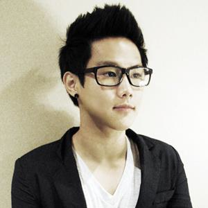
Let’s get to know you first. Tell us about yourself.
Hey everyone! My name is Kevin and I am a designer and an entrepreneur with multiple projects & startup experiences based in Waterloo & Toronto, Canada. I am originally from South Korea but been living in Canada since 2001. I was studying Economics @University of Waterloo but decided to leave school on my 4th year to pursue something that I loved - creating beautiful things. Now I am working as a Lead Designer @Push Science and have few projects of my own @Teamstory and @Growple
I like creating values with great experiences and I don’t like giving up. I first started an e-commerce store while I was in 1st year (exited 3 years later), and made revenue to pay off 4 years of school ;) Then I fell in love with business mixing with great design, so I kept doing different projects - social commerce website, geolocation apps and social networks etc.
I get inspirations from movies, music and watching other people with daily activities (may sound a bit creepy but this is honestly the best source I think). When I am not designing, I am reaching articles on Pulse, ranting on Medium, connecting with people on Twitter, Dribbble and LinkedIn.
Cool, so what’s the story behind your website and its design?
Many people would think my website is very outdated because of the skeuomorphism (the book and all) but I did this for a reason. The website was basically me being me - a rebel.
Everyone was going craaazy about flat design at the time so I decided to go backwards lol. I guess I like standing out. That’s why I have a huge ‘Obama campaign-like’ cover :P I don’t know…it was bold and fun at the time.
I think a portfolio should not only showcase your work but your personality and personal emotions when someone sees it and that was my way of showcasing my rebellious, bold, fun, out of the ordinary character.
What part of your website is your favourite, and why?
The animation would be my favourite. I am a sucker for subtle but great animation. Just adds a little touch but the results are fantastic. Everything just went together well, the book, the opening of the book and so on. But yeah, definitely like the animation :D
Is there anything you wish you knew when you first started building your website?
I wish I knew a better way of showcasing the process of my works rather than the final products. I was focusing on how the works will appeal to the audience but was less focused on my thought process behind the projects.
But I believe everything is a learning process so I don’t regret anything. I’ll just make a better portfolio website after this ;D
Any upcoming changes we should look out for?
There will be a huge redesign to the portfolio in the upcoming months. My focus on the website will be showcasing some of the thought processes behind my works (like I mentioned above) Of course, a sleek animation will add a bit of flavour.
Meanwhile, feel free to reach out! I love meeting new people!


